Tag Archives: iPad

Adobe’s Baggage

In a recent post on his blog, John Nack asked; Affinity Photo on iPad: Will anyone care?

I and a few others posted comments. My response:

I know I do. Over the past year I’ve shifted most of my work over to iPad. I manage 15+ client websites using Coda. On the Mac I’d been shifting most of my non-InDesign work over to Affinity Designer and Photo. I almost never open Photoshop or Illustrator anymore. Affinity Photo is the real deal which is to say, it has most of the features found on the Mac version and can be interchanged from iPad to Mac and back. I bought it immediately and have already used it for several client projects with great delight.

So, yes, some of us do. And really, having a look at iOS 11 it seems pretty clear that Apple’s intent is to keep going with the iPad. They’re deepening their investment and I suspect that as the months roll by many more users will begin delving deeper into it’s capabilities. When Affinity Designer is released I’ll buy it immediately. I’d pay them double what they will likely be asking for it. I’ll use it on this big, beautiful iPad to earn my living.

As much as I’ve enjoyed using my Macs for the past 24 years I now use this new kind of “Mac” that Apple calls the iPad. No going back.

He was kind enough to respond:

Thanks for the perspective. I don’t doubt that you & other professionals would pay double without hesitation, but for a company like Adobe, even that (in this case $26, which is what they’d gross from a $40 sale after Apple takes its cut) just isn’t interesting. Making eight figures with Photoshop Touch wasn’t interesting. They’re going to need that amount or more from you every month in order to justify developing a suite of apps. Now, maybe folks like Affinity can be a lot more nimble and lean, and maybe that’ll be enough. As I say, we shall continue to see.

Really? Really? I guess this confirms my thoughts about Adobe: baggage that is best left behind. They’ve built a monolithic business with a lot of weight and apparently they can’t be bothered. I’ll happily support the fine folks at Serif and encourage you do give Affinity Photo a try.

2017 iPad Pro Reviews Consensus: WOW


Well, it seems the consensus on the new iPad Pro is that it is an absolute monster. Yes, well, you know, a very svelte monster that’s ready to do your bidding. The A10X is off the charts. The new ProMotion is an improvement on par with the switch to Retina, or close to it. Battery life is the usual, 10 hours or better. I’ve not read one review that is not raving about this device or one which has not mentioned how much better it will be with iOS 11.

It’s kind of funny really that for the past year I’ve considered my move to the iPad for most of my work as not only easy but pleasurable. In fact, it’s because I so enjoy the iPad that I made the move. There was no sacrifice or pain, quite the opposite! I’ve been happily using the iPad Air 2 released in the fall of 2014. I rarely notice lag of any sort. In fact, it wasn’t until using the recently released Affinity Photo that I used an app that actually prompted me to wish for faster hardware. Don’t get me wrong, the app is wonderful but it does push the limits of what nearly three year old hardware can do. Even so, the older iPad still handles it pretty well. But the 2017 iPad Pro? Easy Peasy. And with the larger screen? Affinity Photo and a 13″ is a great combination.

Yeah, 9.7″ screen just a bit cramped for some tasks. Editing websites in Coda works pretty well on a smaller screen though I did often wish for just a wee bit more room in my edit window. Also, while split screen on the 9.7 works well, there again, I often wished for a bigger screen. Using split screen with the onscreen keyboard is not advised on the 9.7! Not a big deal as I usually use an external keyboard if I’ll be typing more than a few sentences. So, in my use, this upgrade is not just about a much faster machine with a better screen but also about a bigger screen. 12.9″ is exactly what I wanted. This feels exactly my favorite sized laptop, the 13″ MBA. And again, with iOS 11 around the corner, I think the larger screen is going to be that much better.

Accessories

I’ve not had a chance to use the Pencil much just yet. A few minutes on a current Procreate painting of a nebula and no doubt, it’s better than a cheap stylus on the iPad Air! I’m sure I’ll be getting my use out of the Pencil for those projects. Now, the Apple Smart Keyboard? I’ve used it a good bit over the past 12 hours and I really like it. I do wish that it had the special shortcuts for playing media, volume, home, and spotlight but I’ll make do. Also I wish it had back-lighting. But beyond those limitations, I like the feel of it. Not only that I like the sound of it. Typing on this keyboard has a very pleasant feel and sound that I would describe as quiet but lightly clicks. Even better, it’s very stable. I wasn’t sure how stable it would be and worried that it would be a bit wobbly but in a few hours of usage I’m finding it to be pretty solid. Lastly, I really like the feel of the material used for the keyboard. Not quite cloth or rubber but almost something in between. Time will tell how well it holds up but my first impression is that this is a great keyboard. And the fact that it all folds up into such a compact and fairly light cover makes it all the better.

10.5-Inch iPad Pro Review: A Better Window Into The World Of Apps – Fast Company

As for the new A10X processor–which Apple says is up to 30 percent faster and up to 40 percent faster for graphics–its promise is mostly about letting developers ratchet up the ambition of their creations. You can see why Apple gave WWDC keynote time to Affinity Photo, a hyper-ambitious photo editor that has more of the kitchen-sink capability of full-blown Photoshop than the Photoshop apps that are available for the iPad. The A10x chip’s performance gains are apparent in areas such as the thumbnail previews of filter effects, which gradually pop into place on last year’s iPad Pro and are just there on the new model. This is the sort of app that benefits from as much computational horsepower as it can get–and the more apps there are like it, the better the case for the iPad Pro as a PC-rivaling creativity machine.

iPad Pro 10.5-inch (2017) Review: This Is Crazy Fast

When I first saw the new iPad Pro’s test results from our lab, I thought there was a big mistake. This new 10.5-inch tablet turned in performance scores so high that they blow away most laptops

John Gruber’s review at Daring Fireball:

Apple’s in-house chip team continues to amaze. No one buys an iPad because of CPU benchmarks, but the new iPad Pro’s CPU performance is mind-boggling. Forget about comparisons to the one-port MacBook — the iPad Pro blows that machine out of the water performance-wise. The astounding thing is that the new iPad Pro holds its own against the MacBook Pro in single-core performance — around 3,900 on the Geekbench 4 benchmark for the iPad Pro vs. around 4,200–4,400 for the various configurations of 13- and 15-inch MacBook Pros…

All that said, the real story of these new iPad Pro models can’t be told today, because that story is iOS 11…

It feels like a hand has been untied from behind my back, and this amazing hardware has finally been allowed to run free.

Matthew Panzarino, An iPad Pro 10.5″ Not Review:

With the iPad Pro, especially when it’s armed with iOS 11, it’s beginning to feel possible to see Apple in this world. The combination of custom silicon, a still robust and specifically attuned software ecosystem and a focus on security, Apple has everything it needs to make a strong showing here.

Whether it leads to immediate growth of the category I don’t yet know – but this particular recipe is coming to maturity. The iPad is a full-fledged computer, and you can argue against it but you’re going to increasingly sound like a contrarian.

Pre-WWDC Apple Nerdery

Wow. So much going on in the run-up to WWDC. As most have said, it looks to be a big one with likely hardware announcements. Apple seems to be releasing bits of news this week that would normally have been in the keynote prompting many to suggest that they are making way for a jam-packed presentation.

I’m not an educator but if I were I’d be very excited about what Apple is doing with Swift Playgrounds. The next update, due Monday, expands coding education to robots, drones and musical instruments :

Apple is working with leading device makers to make it easy to connect to Bluetooth-enabled robots within the Swift Playgrounds app, allowing kids to program and control popular devices, including LEGO MINDSTORMS Education EV3, the Sphero SPRK+, Parrot drones and more.

That’s going to be a lot of fun. On the topic of Swift, Fraser Speirs has an excellent post about teaching Swift over the past year.

I’m looking forward to new iPads being announced and hopefully the long rumored and hoped for “Siri Speaker”. And of course all of us iPad nerds are hoping for big iPad features with iOS 11. We never know until Apple announces it but I have a feeling (as do many others) that we’re going to see some great stuff Monday!

Panic and the price of “pro” apps for iOS

Panic posted it’s The 2016 Panic Report and offered this very glaring and blunt statement about developing and selling iOS apps:

  • iOS continues to haunt us. If you remember, 2016 was the year we killed Status Board, our very nice data visualization app. Now, a lot of it was our fault. But it was another blow to our heavy investment in pro-level iOS apps a couple years ago, a decision we’re still feeling the ramifications of today as we revert back to a deep focus on macOS. Trying to do macOS quality work on iOS cost us a lot of time for sadly not much payoff. We love iOS, we love our iPhones, and we love our iPads. But we remain convinced that it’s not — yet? — possible to make a living selling pro software on those platforms. Which is a real bummer!

Yikes. Very disappointing. But I have to admit that I have very mixed feelings about Panic. I’ve used Coda and Transmit on the Mac for years. Now I use them on my iPad and they are two of my most used apps. They’re great apps. But here’s the thing, as much as I enjoy and use Panic apps there is this other thing that kind of bothers me. Take the statement above. Who the hell was using Status Board? My (admittedly vague) understanding is they started that app for themselves and used it in house. I may be mis-remembering that. But regardless, I looked at it and while neat I had absolutely no use for it. I don’t see how Status Board was a pro level app. Or, if it was, I don’t see why the failure of that one app should impact 3 other iOS apps that are most definitely “pro” apps and which I suspect have a much larger, more committed user base.

Panic’s public face often seems silly to me. A year or so ago a big deal was made about their clever sign. They seem kind of squirrely in that they seem to get distracted by fun and otherwise cute projects. On a certain level, that’s great. Fun is good, whimsy too. But it just seems odd that they put that much time and effort into a sign with an iPhone app that people can use to change the colors of the sign and yet, a year later they are complaining about the time and energy investment in iOS apps not paying off. It seems odd.

Meanwhile, Coda, introduced on the Mac in 2007, currently sits at version 2 which was released in 2012. That’s 5 years per version. Which seems a little long but not too bad. But based on Panic’s 2016 review and 2017 projection we should not expect Coda 3 anytime soon. I’m fine with that as I’m not using the Mac version much at all. But in the comments to their post was a link to a twitter thread involving a bug/missing feature in Transmit 4 (the current version). It was brought to their attention in late 2014 and while Panic replied steadily as time progressed the issue has yet to be addressed even though Panic first suggested they had a fix as far back as early 2015 and yet, two years later, that thread is still going and that issue is unresolved. That is poor form. And I’m sure it’s not the only example.

Panic is one of those companies that has a sterling reputation in the Apple Nerd Herd and I’m conflicted as to whether it is deserved. It’s important to be realistic in our expectation. I often think folks are not very realistic in their expectations of Apple. Perhaps I’m being too harsh in my assessment of Panic. They’ve got a nice chart demonstrating how active they were in updating their apps over the course of 2016 and they were. A few new features but mostly lots of bug fixes. Looking at the release notes it was lots of bug fixes. That’s not to trivialize the updates because removing bugs is important (hence my comment in the previous paragraph).

To reiterate, these are fantastic apps and they seem to be solidly supported. I suppose I just don’t understand their complaint about selling apps for iOS. It is they who set the prices. As of now it looks like Coda sells for $24.99 and Transmit is $9.99. In 2015 Coda was only $9.99 and was a free upgrade to those that had purchased the first version. That seems far too low to me and is certainly lower than the Mac versions. Why not bump up the price? I paid a good bit more for the Mac version of Coda and would happily pay more for the iOS version if it was asked and if it meant that Panic would be more committed to development on the iOS side of things.

I’m not an app developer. I’ve not done a comprehensive review of the costs of iOS apps that are being built for and sold to professionals. I do think that the developers of professional grade apps such as Coda and Transmit should sell their apps at a price they think is fair for the product. If it’s the same price as that being asked for the Mac version then so be it. I know that a version of Affinty Designer is in being worked on and if it sells for the same price as the Mac version I’ll pay it. Again, I’ll pay it enthusiastically because it’s an app I want and need to make my iPad more valuable as a tool for my graphic design projects.

This post seems a bit unfocused to me. It was Panic’s recent statement about selling “pro” iOS apps that set me off. Panic goes out of it’s way to share the many ways in which it is whimsical and it’s apps delightful to use. It’s evident in the design and presentation of the blog, the website, the apps. Whimsy is everywhere and it’s wonderful. But when it comes to pricing their apps, valuable tools that do indeed help professionals get real work done, maybe Panic needs to take itself and it’s user base more seriously.

iPad Journal: Painting astronomical objects with iPad and Procreate

Just to be clear from the start, aside from grade school, I've never painted anything other than room walls and home exteriors. I'm not a "painter" and only occasionally had a passing interest in trying it out. I've sketched a few times but there too, very minimal. A few months back the iPad app Procreate popped up on my RSS or twitter feed. I had recently bought some supplies to begin an attempt at sketching astronomical objects while observing at the telescope. Those supplies have gone unopened and sit in their original bag. I'd not really figured out how to go about setting up to sketch in the near dark but it was on my mind as something I wanted to try. Suddenly a lightbulb went off and I had the thought that perhaps I could use Procreate and the iPad to sketch? That approach might be easier because I always have the iPad out with me anyway. So, no extra supplies, no set-up of lighting and supplies. I'd give it a go.

My first effort was Mars which was a pretty basic object to paint/sketch. A circle with a few faint strokes to denote a few of the larger features viewable through the telescope. The next was the Lagoon Nebula. A little more too that but still not a whole lot. Then it occurred to me that it might be fun (and good practice) to try my hand at painting an object from a photograph. Actually, it was not quite like that. It was more like a moment of boredom as I was looking at the a beautiful image of the Eagle Nebula on the cover of a book sitting on my coffee table. It occurred to me to give it a try. To be honest I didn't expect it would go as far as it did. I'm often good at starting little projects but often don't finish. For some reason in this case I found myself drawn in.

I started playing with the brushes. There are many, many brush options in Procreate. I had absolutely no idea where to begin. I tinkered with a couple of brushes and settled in on the airbrush as it seemed the best candidate for painting something like a nebula. I focused on just a portion of one of the "Pillars of Creation" and after a couple hours I decided to try a larger portion. Over the course of a few days I came back to it. It was surprised how quickly time seemed to move as I focused on the "brush". I would look up and two hours would have passed. After about 15 hours I had this:

As it turns out the process is very enjoyable. I worked mostly with the airbrush on the first project. I worked i layers in a way mimicking what I imagine the dimensionality of an actual nebula to be. I created a background of black and on top of this a layer of background nebulosity. On top of that another layer of nebulosity. And then another. And another. Stars had their own layer on the very top though in reality, of course, the stars in intermingled dimensionally.

A few weeks later I decided to paint a much larger portion of the Eagle Nebula though not the whole thing. I started with my existing painting of the pillars and then painted them in. I used the same brushes and techniques. I finished that in about a week.

The next project was the Orion Nebula and then the Lagoon Nebula. The most recent was an infra-red image of the Horsehead nebula which shows the detail of the nebula not seen in the visual spectrum. My current project is a wide field view of the nebula that surrounds the Horsehead, IC 434 and the Flame Nebula NGC 2024. Really, it's just a complex of various nebulae of which the Horsehead is just one, tiny component.

Clockwise from top left: In process IC 434 (tiny dark spot near the middle is the thick gas and dust of the Horsehead Nebula), Orion Nebula, Lagoon Nebula, close-up Horsehead Nebula in infrared

Clockwise from top left: In process IC 434 (tiny dark spot near the middle is the thick gas and dust of the Horsehead Nebula), Orion Nebula, Lagoon Nebula, close-up Horsehead Nebula in infrared

As I've worked through these various projects I've been trying out some of the different brushes available. There's so much to learn. I have no idea how this compares to painting on a canvas though I expect some of it would carry over to that process. I do feel as though I'm making some progress. Learning how to see details I would have likely missed in the past. Learning how to use the different brushes and their interaction with one another. Learning how to layer and blend color. Painting with Procreate and the iPad has allowed for a whole new experience, a new form of expression that I would not have had otherwise. It's something I thoroughly enjoy and intend to continue with for a long time to come.

iPad Journal: iCloud and DropBox as iPad File Systems

A consistent criticism of iOS and the iPad is the lack of an easily assessable file system but this is only partially true. When the iPad first shipped in 2010 it certainly was much more limited. But eventually Apple added iCloud which has evolved into Apple’s version of an cloud-based file system and it works fairly well at this point. It’s not perfect but it has been rock solid in my use of it. But, still, time and again, some continue to say the iPad has no file system and no access to a file system. Well, it’s certainly not the full featured Finder that the Mac has and it’s true that it accumulates folders for apps (Mac or iOS) that use iCloud for saving files. But, it IS a file system.

There are different methods to access iCloud files. From within an app is probably the most common way. By default when I open an iWork app I see that app’s documents as they reside in iCloud. But it is also possible to view iCloud folders via the iCloud Drive app or from the file picker. So, for example, if I want to attach a file to an email I can browse through my iCloud folders. It works pretty well. But in many ways the iCloud Drive app is clumsy and somewhat limited. For example, creating new folders in iCloud Drive app is not obvious. I must first select an existing folder or file and then I am then given an option to create a new folder. Also, customizing the iCloud Drive app is very limited. I can choose to view in a grid of icons or as a column/list view hybrid. It is possible to sort by date, tags or name but not possible to add new tags. There is no way to “Get Info” for a file.

I interact with the iCloud file system (usually from within apps such as Pages or Numbers) on a daily basis and it does work very well in that regard. But it is no Finder replacement. Rather, it presents a simplified, iOS version of the Finder. It’s the sort of thing that will frustrate power users coming from the Mac but be perfectly fine for less technically experienced users such as my granny.

By comparison, the DropBox app feels like a step towards being a Finder replacement. Well, it’s clumsy in its own way but it feels a bit more like the Finder. It does not offer a list or icon view but the column view it presents works fairly well. I can pretty easily navigate through a hierarchy of folders and when I land on a file I get a preview of the file. Even better I can create new folders, add files, etc. Just as I might on the Mac I can browse files and open in their native apps or import into another app. So, I can click on a Word document and open into Word or into Pages. Or I can share it using the normal DropBox method which creates a link which can be shared via email or Messages or any other way I might send text. Or I can export the file and share it as an attachment. If it is a file in a folder shared with a client it’s also possible to have a conversation via comments on the file right in DropBox.

I use DropBox everyday and consider it an indispensable part of my iPad workflow especially when it comes to collaboration. In fact, when it comes to collaboration DropBox on iOS even surpasses the experience on the Mac. For example, commenting on shared files which cannot be done from the Finder. Also, Inviting others to a shared folder or managing the share settings for a folder are all easy to manage from within the DropBox app. All of these things require using a web browser if you’re working on a Mac.

The DropBox app is updated on a regular basis and recently was updated to add support for Split View which is a great addition and very helpful.

The DropBox app is updated on a regular basis and recently was updated to add support for Split View which is a great addition and very helpful.

And of course anything in DropBox is available on any device connected to the internet. I’m not using my Mac as much as I used to but when I do I know that any files I’ve got in DropBox will always be up-to-date regardless of which device was last used to edit the file. This leads me to one last bit that is very specific to my website management workflow. At the moment I have nearly 20 client sites1 that I manage. Before switching to my iPad as my primary device I used to use Coda on the Mac and configured each site to have it’s “local” files in a folder on DropBox. It worked very well as I could switch between my MacMini and my MBP and know that the local files were always in sync. With iOS, Coda does not offer DropBox as a choice for the local files. Instead they are truly local files on the iPad but luckily they are shared with Transmit on the iPad. My super easy solution to back-up these files to DropBox? I open up Transmit on the iPad and connect to my MacMini which is always on as my media server. I can very easily sync multiple folders, files, etc. to the DropBox “Websites” folder on the Mac and it all goes to the cloud automatically. It’s not as easy as it would be if the iOS version of Coda offered DropBox as a “local” file option in the first place but it’s relatively painless and a good example of how a local Mac can serve as both a local back-up and a gateway to DropBox.

  1. Usually only 5 or so are “active” in any given month.

iPad Journal: Using Pages

Last time I discussed my use of Numbers. Another useful iWork app and one that is probably better known, is Pages. This is another one that has long been available on the Mac and one which was ported over to the iPad right at the beginning. It’s not quite as powerful as its Mac counterpart but it is VERY close. Also, Pages documents are interchangeable between the Mac and iOS. There have been several occasions when I’ve nearly completed a project on the iPad and then just finished it on the Mac so that I could add in a font that is not installed on the iPad. Easily adding fonts to the iPad is one of those features Apple will need to eventually add if they truly expect people to use iPads as primary or only computing devices. Most people won’t need to bother adding fonts but some of us that are the target of the “Pro” marketing do.

Some of my most recent projects using Pages included brochures for a local business as well as a brochure for our local library. In both cases I started with one of the included brochure templates provided by Apple. I add the client’s content, tweak the design and it’s ready to go. I’ve also used it recently for several event posters and flyers. It’s quick and easy for such projects. Pages is no substitute for something like Adobe’s InDesign but it works very well for brochures, small newsletters, posters and more. At the moment one of the features I miss most is the lack of linked text boxes which are often necessary for larger documents such as newsletters and annual reports. There are other limitations such as no text on path and no stroke for text, features I sometimes need for event posters and flyers. On the Mac version of Pages a pen tool is available but it is, sadly, missing on the iPad. The iPad does offer a line tool but it only allows for one curve. It would be great to see the pen tool added to the iPad.

On the upside, some of my favorite features are the wide variety of graphic and style tools. Of course we expect things like tables and shapes but Pages makes it very easy to add a variety of nice stylistic touches. From different image frames to hover shadows to reflections. Of course such effects need to be used with restraint but it’s very nice to have them.

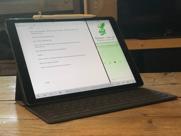
Lastly, I use it for longer, basic text documents. I often do podcast transcripts and find Pages to be the perfect fit for that job. I open it in split view with Pages on the left and Apple’s Podcast app on the right. This allows for very quick pause and playback control via the bluetooth keyboard as well as the speeding up or slowing of audio with a touch of the screen. I’ve transcribed 30+ podcast episodes this way and it works fantastically.

When I’m done with a document the client usually needs it as a pdf. I export right to DropBox then I pop over to Mail or Airmail and attach the pdf. I could just as easily export to pdf and attach to an email without saving to DropBox but I like to keep the pdfs. Also, using Dropbox allows me to attach multiple pdfs per email which I sometimes need to do. Dropbox serves very well as a compliment to iCloud as a filesystem for the iPad, a topic I plan to address soon.

iPad Journal: Using Numbers

One of the best apps on the iPad is Numbers. For anyone that needs spreadsheets it is essential. I've been using it since it was first introduced on the Mac and then as soon as it was available on iPad. I suspect that, based on some interactions I've had with acquaintances, Numbers is one of those apps that could benefit from some Apple iPad promotion. People seem to be unaware that it exists or, if they are aware of it, do not know what they can do with it. As David Sparks wrote in a recent article about iPad :

If Apple wants to see an increase in iPad sales, I think the answer is making them more useful and getting the word out. Apple should get serious about adding features to iOS that allows users to be more productive in getting their work done. On top of that, Apple should start demonstrating to the public with some its clever advertising how lots of normal people are getting work done on the iPad. I'm not talking about videos of people taking the iPad deep-sea diving but instead how people use it to make spreadsheets, write documents, and all the other work that most of us do to pay for our shoes.

A great example of putting Numbers to work is a client that recently needed some updates to labels for her hand-made soaps and lotions as well as updates to the order form her sales rep uses. As it turns out her order form had been put together by a previous designer using Illustrator. While it looked nice visually it was a mess to edit and was only functional when printed on paper. In conversation with her it became apparent that she would like for her sales rep to be able to enter the data right on her iPhone or iPad so that they could be quickly and easily emailed immediately after the order. The obvious choice was Numbers.

Within an hour I had a Numbers spreadsheet that looked nearly identical to the pretty form created in Illustrator but now she had a form that worked on device, would auto-calculate the total for each line item then calculate the total for each section and, finally, calculate the total amount of the order. No more hand writing and scanning. The whole process is easier and faster for both the sales rep and my client. Even better for my client (not so much for me), she can now update the items in the Numbers spreadsheet herself rather than hire me to do it.

This is the sort of easy to set-up and use workflow that the iPad is perfect for.

Another example would be a Numbers document I created to track my utilities usage. My tiny house shares a utility line with a cabin owned by my sister and her family. I'm a full time resident and they are part-time visitors on weekends. I've got a spreadsheet set-up that allows for easy entry of monthly usage, amount paid and various calculation fields do the work of sorting the payment amounts. I've also used it to keep track of all sorts of data for projects and interests including the membership roster for our local astronomical society, astronomical observing lists, a list of NASA missions and the Periodic Table of Elements.

Numbers is a great way to get started with spreadsheets. It may not be as powerful as Excel but I've found it meets (and exceeds) all of my needs and works great on the iPad. Like all iWork apps it also comes with some great templates that are often a great way to get started on a project. For folks that might need a larger feature set, Excel on the iPad may be the better way to go though I can't say much about it as I've not used it.

One way I hope to see Apple improve Numbers might also require an iOS change and that is to allow for two Numbers windows in split screen mode. I'm sure many would agree that there are times when having two spreadsheets open side by side would be very helpful. For example, I can easily imagine a business owner like my client mentioned above compiling a monthly report of sales in which case she might easily want two Numbers documents open at the same time.

I don't doubt that Apple has plans for such improvements and I'm looking forward to them.

Serenity at iMore is doing a column on people who use the iPad for work

She's already tweeted that she's had a great response within just hours of putting out the request: Use an iPad for work? We want to hear about it!

Hey iMore readers and friends! As part of my ongoing quest to explore working on the iPad Pro, I'm looking into starting a column interviewing folks who do a significant part of their job using an iPad. This doesn't mean the iPad is your only method for work — just that you're using it actively as part of your job.

Based on the screenshot of emails she provided it looks to be very promising. Apple really could and should be doing this sort of thing to promote the iPad1.

  1. I generally avoid statements about what I think Apple should or should not do as it makes me laugh when others do it. Generally speaking Apple seems to be doing a pretty good job over the past 15 years. But, given they've done practically nothing to promote the iPad I'm going to go ahead.